In 2018, I worked with Baltimore City Recreation & Parks (BCRP) to develop their brand identity. Rec & Parks,
a city agency with a strong public presence, needed a brand that was fresh, accessible, and versatile. The brand would have to encompass BCRP’s 100+ parks, 40 recreation centers, dozens of facilities, as well as its forestry division, special events, capital development, and other outreach activities, and be usable by their many employees.
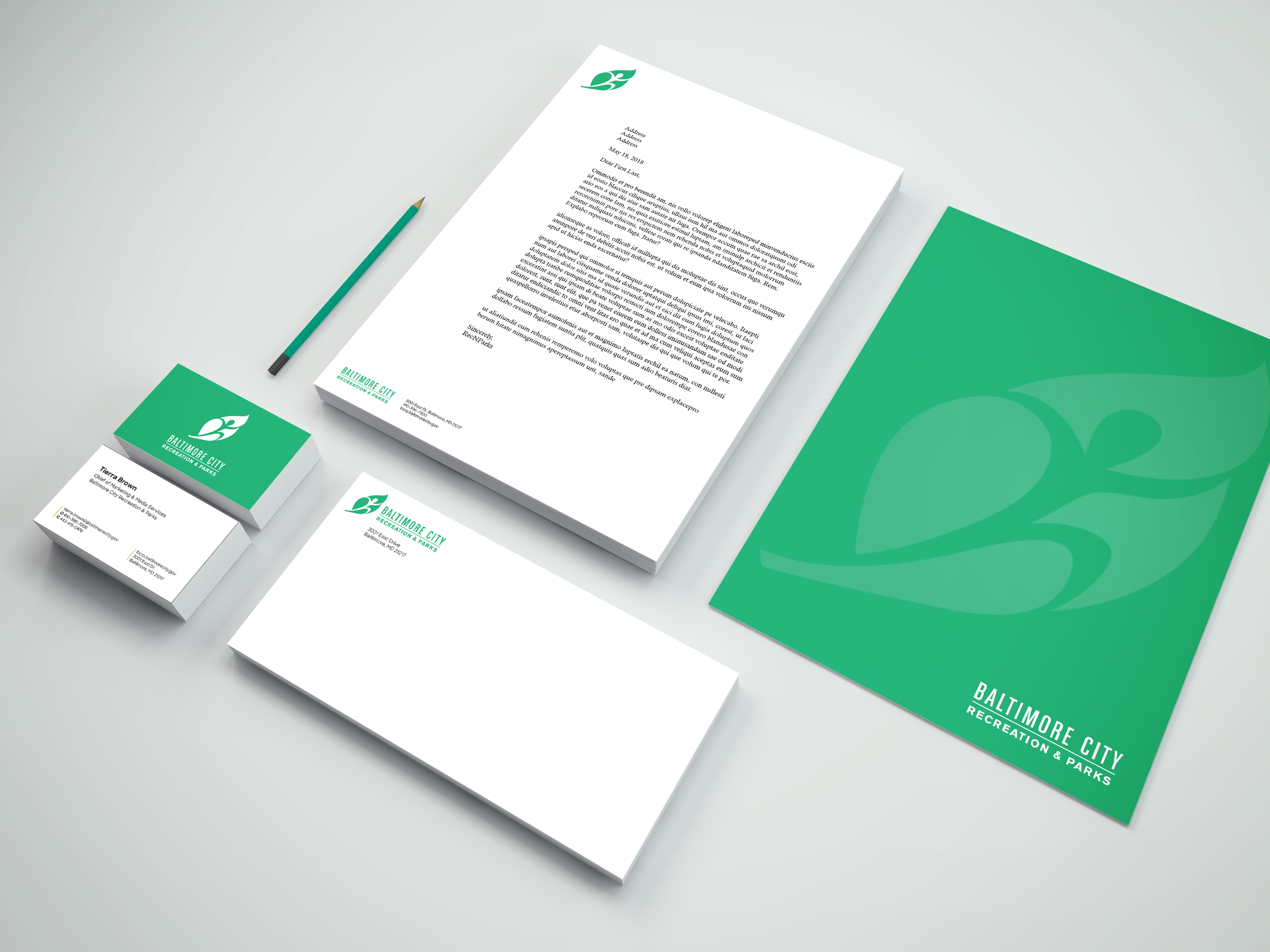
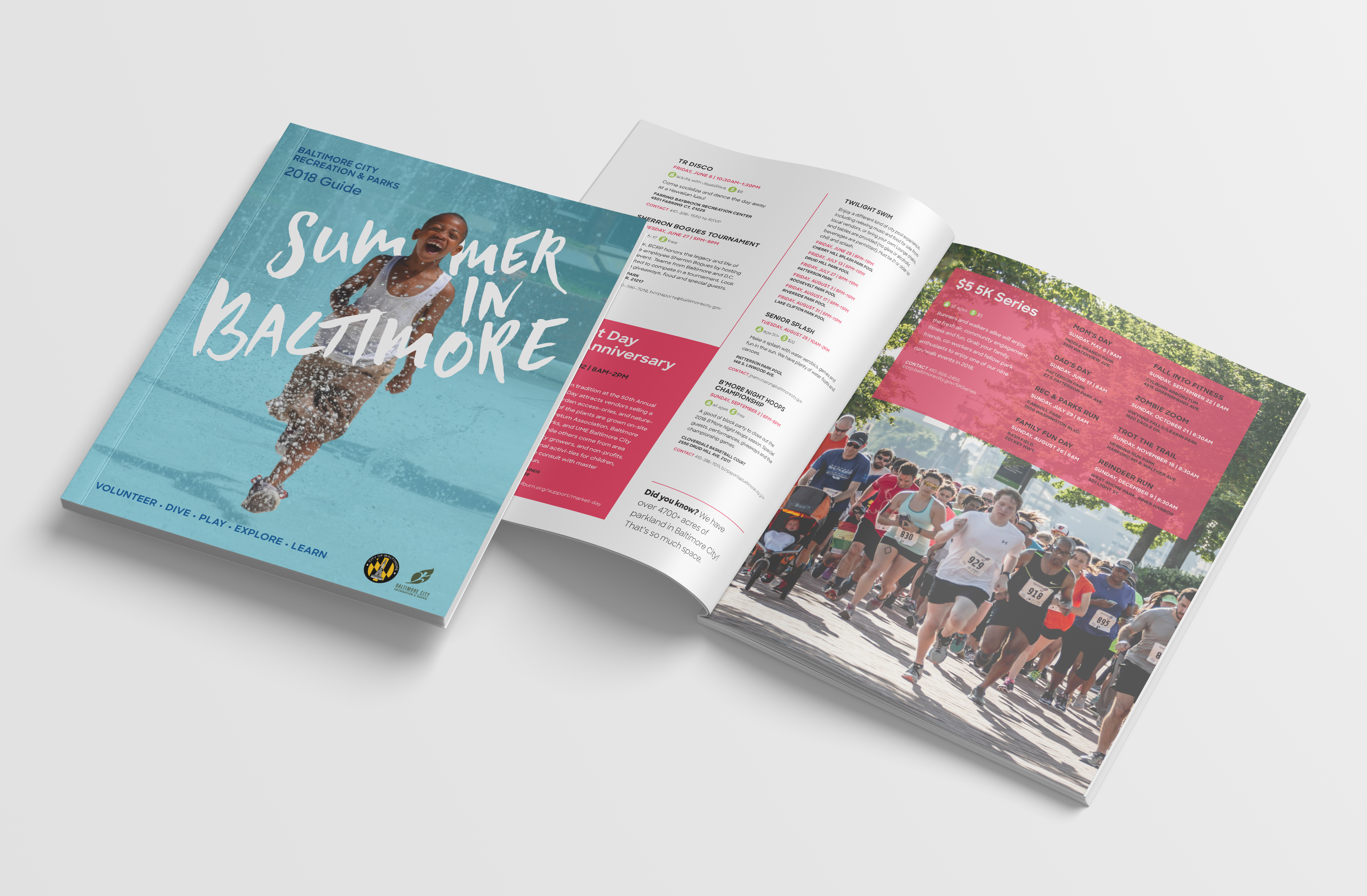
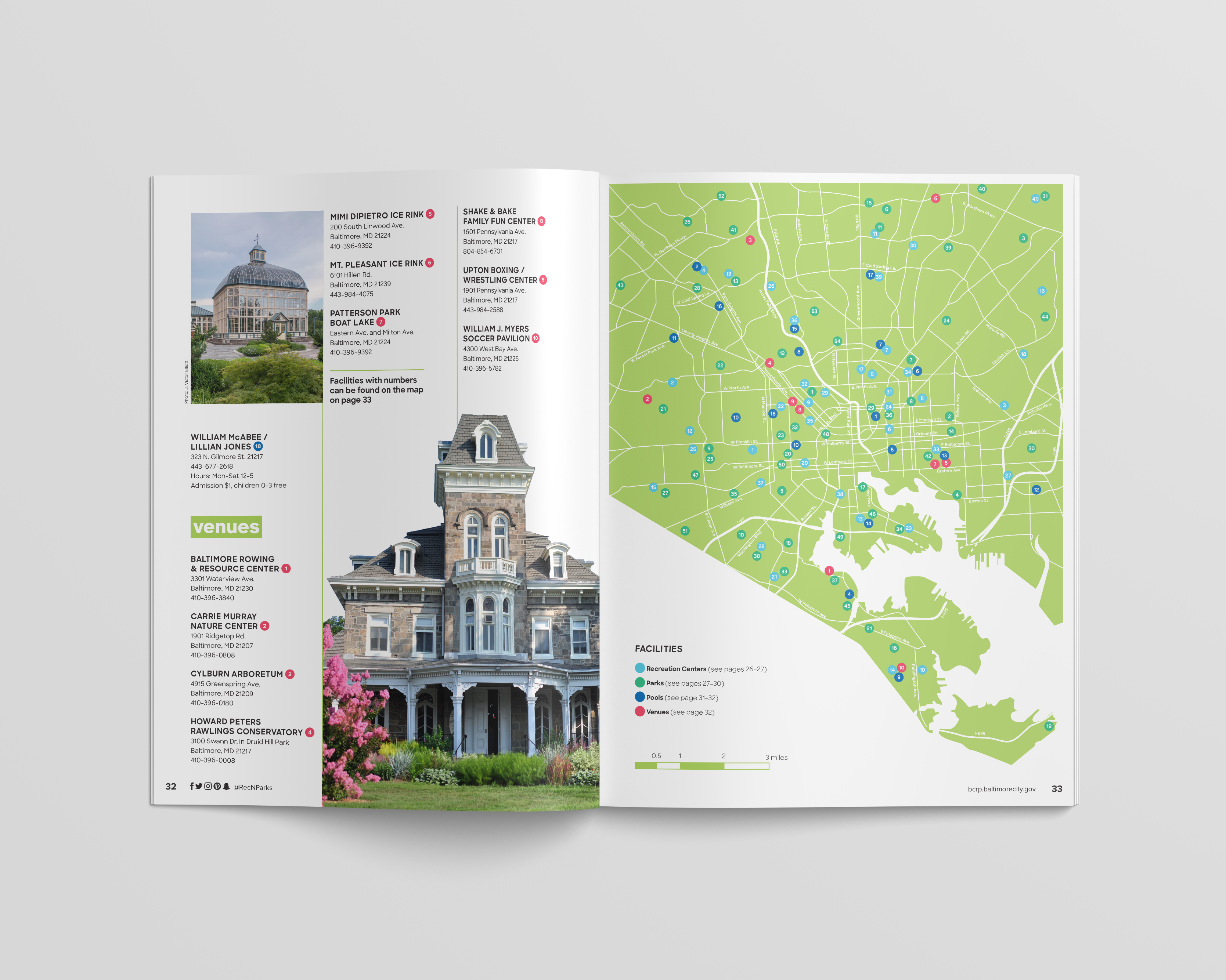
Working with BCRP's Office of Communications, I developed a new brand identity and a range of deliverables including brand guidelines, icons and graphics, printed program guides, signage, apparel, and document templates.
New primary logo
New horizontal lockup
While Rec & Parks wanted to retain their logo, which is in wide use throughout the city, they found it was being used inconsistently, being distorted, and was often inadequate for many applications. We refreshed the logo using the new brand color and created both vertical and horizontal lockups that could be used in a variety of placements.

Primary Brand Color

Parks

Recreation

Special Events

Forestry

Capital
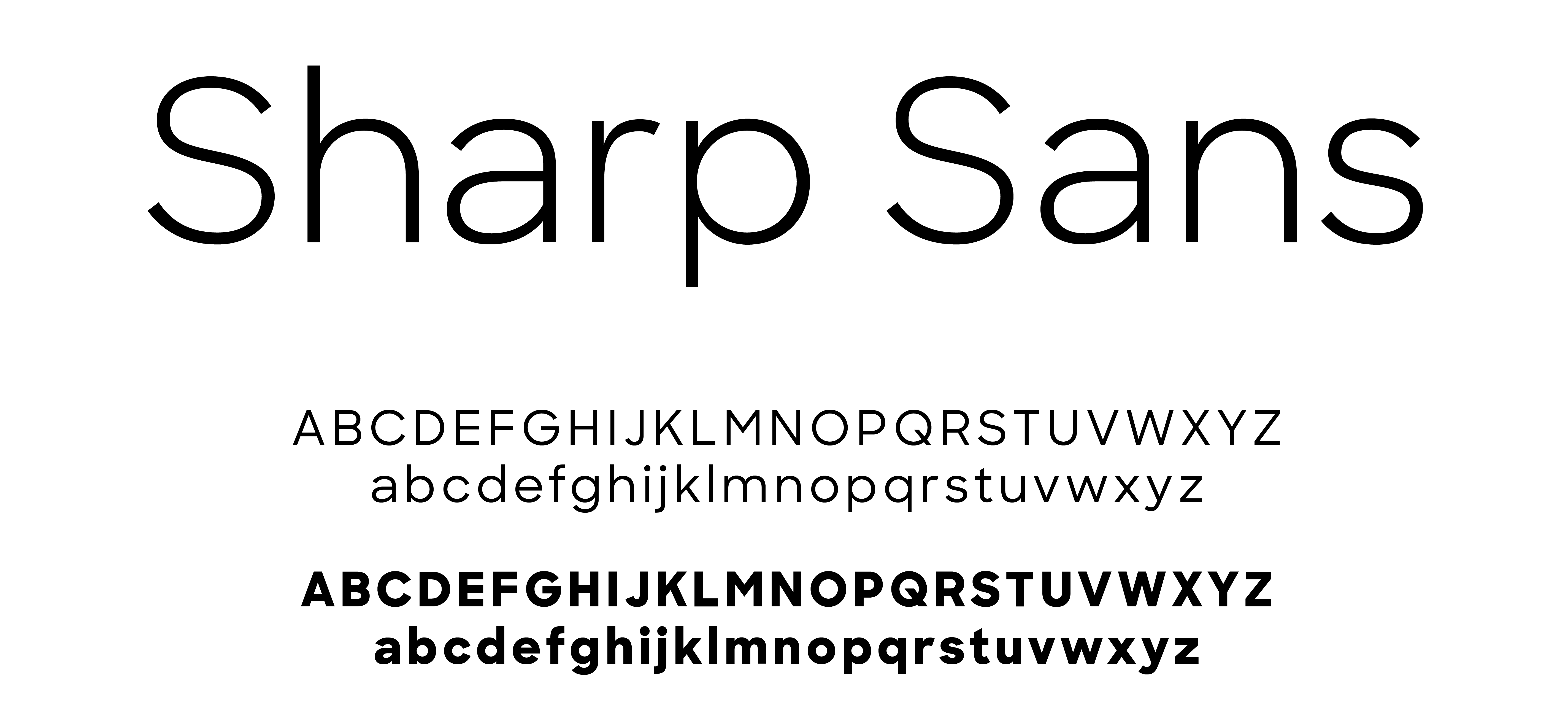
Primary Typeface
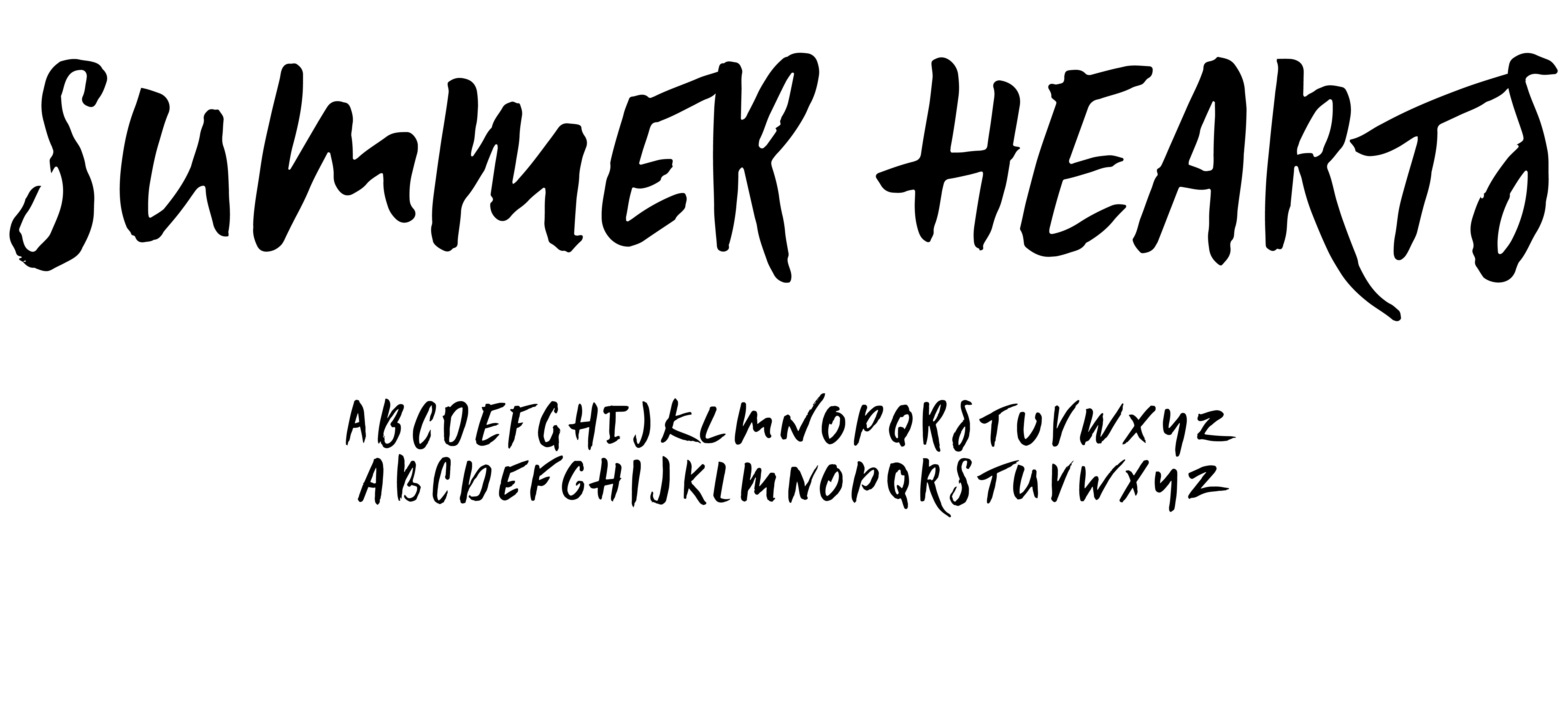
Display Typeface
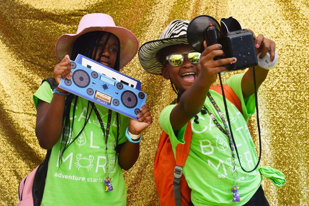
Camp Baltimore t-shirts (photo courtesy of Baltimore City Recreation & Parks)
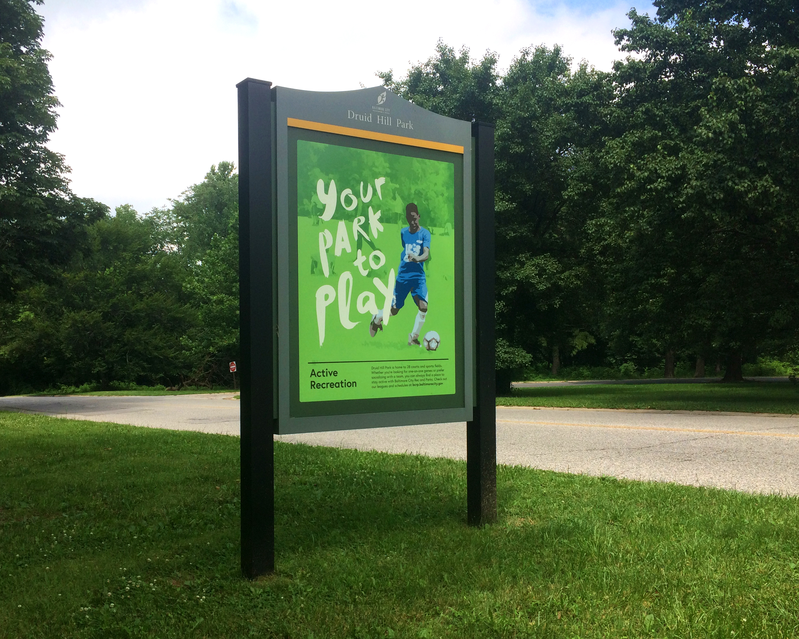
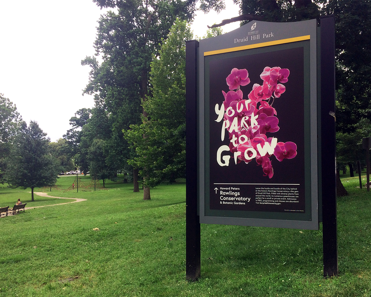
Environmental graphics in Druid Hill Park